CCPSurvey2014
Contents
Global Collaborative Computational Project (CCP) Survey results
Over 2014 the visualisation group, part of the Technology Division within SCD, has reconsidered the real visualisation needs of the computational sciences community. A series of informal and formal surveys are underway and the first small ones have tackled the Tomographic Imaging and CFD (Computational Fluid Dynamics) communities. These wanted to find out which tools were actually being used and the best methods to support them. A global CCP survey was also undertaken and a discussion video conferencing presentation for this occured just before Christmas 2014.
Executive Summary
Key was a difference between choice of primary and secondary package:
- Three packages are the most-used packages by 26% of respondents.
- Conversely, another 31 packages are used by one or two users and account for a further 26% of respondents.
Producing publication quality plots is the most-used technique. However, the features making these packages the favourites are:
- Software that is written specifically for their domain of interest.
- Large datasets are handled efficiently.
- Scripting or other ability to extend the tool is required.
Users second most favoured packages are general purpose visualisation tools.
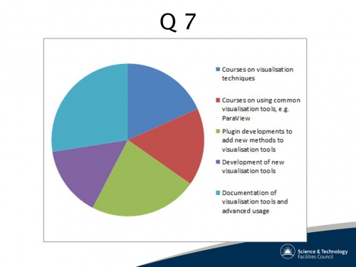
Users were given five options for selecting their most required development. None emerged as being more needed than the others.
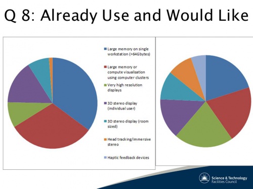
Conversely, large amounts of memory was clearly the most important requirement for high performance visualisation.
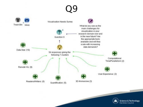
The main future challenges are suggested to be
- The ability to handle large amounts of data
- The ability to operate in a distributed environment.
Survey Presentation
Surprisingly, open source was not always the most important issue but the easy creation of plug-ins, new readers and writers, as well as analysis tools have been requested. There was also indicated a strong growth in the use of the ParaView visualisation system (http://www.paraview.org/) that is an open source, multi-platform data analysis and visualisation application where users can build systems including adding qualitative and quantitative techniques.
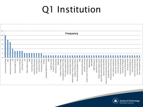
Q1 Home institutions
The wordle gives an indication of the distribution,
but the institution links allows us to see the extremely long tail that makes the statistics not a power law relationship.
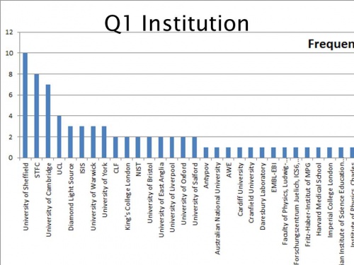
Zooming in we can see the individual major establishments.
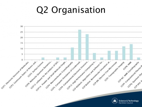
Q2 Which CCP(s) are you involved with?
Looking at the 'old' CCPs there were very few responses which indicates users have moved on to new CCPs or institution facilities.
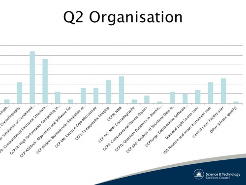
The newer and therefore more current organisations have a larger response; with CCP5 and CCP9 being popular source code repositories and ISIS and CLF being popular user communities.
Q3 What software do you use for visualisation of data?
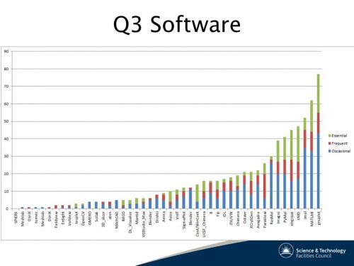
Looking at the usage with both 'frequent' and 'essential' categories then we have the following curve.
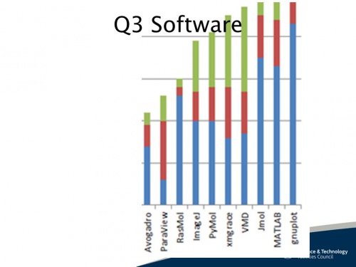
again we can zoom in and see in more detail the most popular tools.
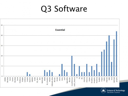
But removing the frequent and just looking at 'essential' tools the graph is very different and shows how different user communities use different tools.
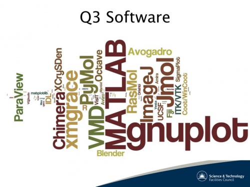
A wordle can also be useful to spot your favourite tools
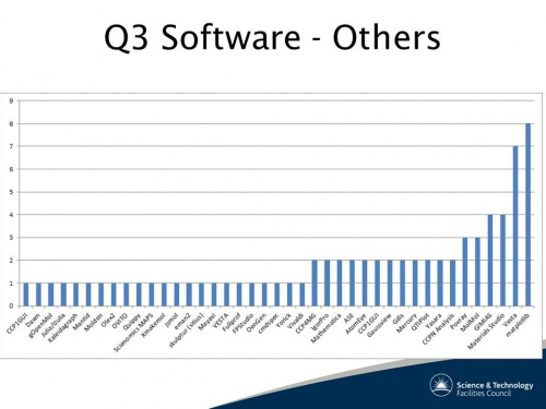
When asked about other tools there is an even longer tail to be found.
The three most often used tools (gnuplot, MATLAB, Jmol) account for 26% of the responses and conversely, there is a tail of 31 packages that also accounts for 26% of the responses. Similarly the top four Essential tools (gnuplot, MATLAB, VMD, xmgrace) account for 42% of the responses. We need to ask why is there a long tail? Are there any useful features provided by the less popular tools that are not provided by gnuplot, MATLAB or Jmol? This is answered in the comments of questions 5 and 6.
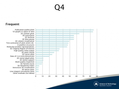
Q4 What visualisation techniques are important to your work?
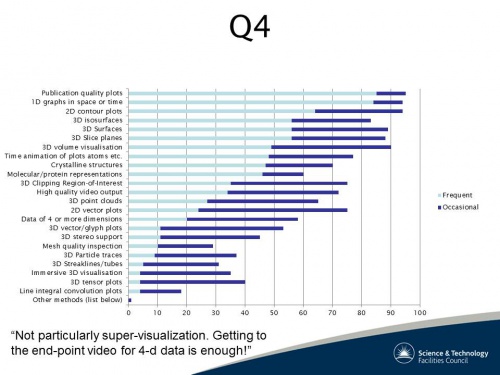
This is less radical when we also add the 'occasional' used techniques.
The most frequently used visualisation technique is to produce publication quality output. The facility to produce line graphs is equally important
Q5 Comments on the respondents' most used visualisation tool.
This section is converted into an interactive exploration. In summary 91 replies were given with the most commonly used tools, are:
Of the other tools, the major reasons for choosing them were:
- ASE: quick and easy to use
- Avogadro: open source
- gnuplot: quick to use, scriptable
- ImageJ: free, easy, plugins
- Paraview: easy of use
A few observations can be drawn from these responses;
- Users will prefer software that is written specifically for their domain of interest.
- Large datasets must be handled efficiently.
- Scripting or other ability to extend the tool is required.
- Publication quality output is a valued bonus
Q6 Same as question 5, for any other tool used.
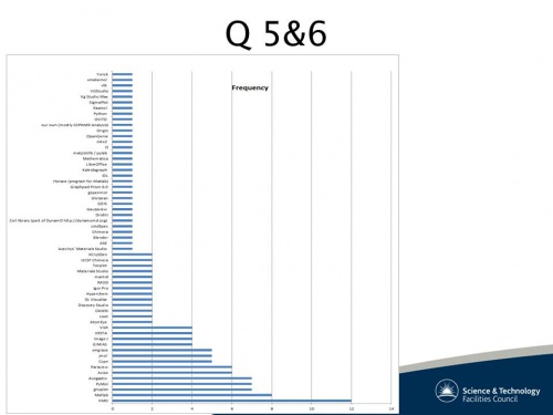
Regarding the second most used visualisation tool 47 replies were given. The most commonly used tools, with links to answers are:
- gnuplot - 5 replies
- Materials Studio - 3 replies
- MATLAB - 3 replies, but is not discussed in this section as the responses are extremely similar to those in question 5.
- Paraview - 3 replies
- PyMol - 3 replies, also not discussed here.
- VMD - 3 replies, also not discussed here.
Other tools that had two responses:
- CCPN Analysis
- Discovery Studio
- IMOD
- JMOL
- Vesta
- Visit
- xmgrace
A few observations can be drawn from these responses:
- Users seems to prefer software that is general purpose.
- Large datasets must be handled efficiently.
- Good quality documentation/tutorials is required.
- Ability to read multiple formats is useful.
We can combine the frequency of tools in Q5 and Q6 to produce an interesting frequency graph.
Q7 Visualisation requirements. How important do you see the provision of the following (ed. Services)?
Q8 Requirements for high performance/advanced visualisation facilities. Do you have any need for access to (ed Services)
Q9 What do you see as the main challenges for visualisation in your domain now and in the near future?
Q10 Any other comments?
Summary
- Code development/maintenance in various guises
- Training in using various packages is required
Raw Comments
- Would be nice if there was an obvious preferred open source tomographic reconstruction code that we (STFC/EPSRC) could recommend to users and modify ourselves for our own needs. If there are candidates here, maybe publicise the options more widely?
- Would be nice to have somebody looking into maintenance and support of useful tools and software.
- Visualisation and application of calibrations to data go hand-in-hand together, thus the greatest visualisation tool won't be used much if it isn't integrated into a data handling flow. A good example is XCrysDen, which makes all the difference between just number crunching with wien2k and actually seeing what you're doing.
- It would be great if the visualisation tool developers would start to collaborate to develop libraries, data formats etc that could be shared between them, to speed up the development of new tools and functionality, and allow users access to the full spectrum of tools they require.
- I'm happy to get involved with this CCP/project or any initiative it might lead on with. I'm passionate about data visualisation and have experience in developing such tools.
- Training on visualisation tools are really lacking. There should be more of them.
- More seminars to introduce what is available
- There is a strong need for web-based visualization methods to integrate into web-based applications we are developing.
- License sharing and advanced usage training
- Lack of tools limits the science we are able to achieve.
- Final note - Martin Turner at RAL is brilliant at cross promotion (between communities) and compiling enthusiastic newsletters and should be thoughtfully praised for his dedication to the subject. He and his team are successfully promoting the ideas that other communities are way ahead in.
- I'm not sure if Diamond are as involved as they could be. If they are it certainly isn't communicated well to Users.
- Many of the packages are great for visualization but quick mathematics (e.g. subtract two 3d data sets) requires recoding.
Future results
There will be a six month review in Spring 2015 - but remember from the presentation "The user and viewer are always important"


